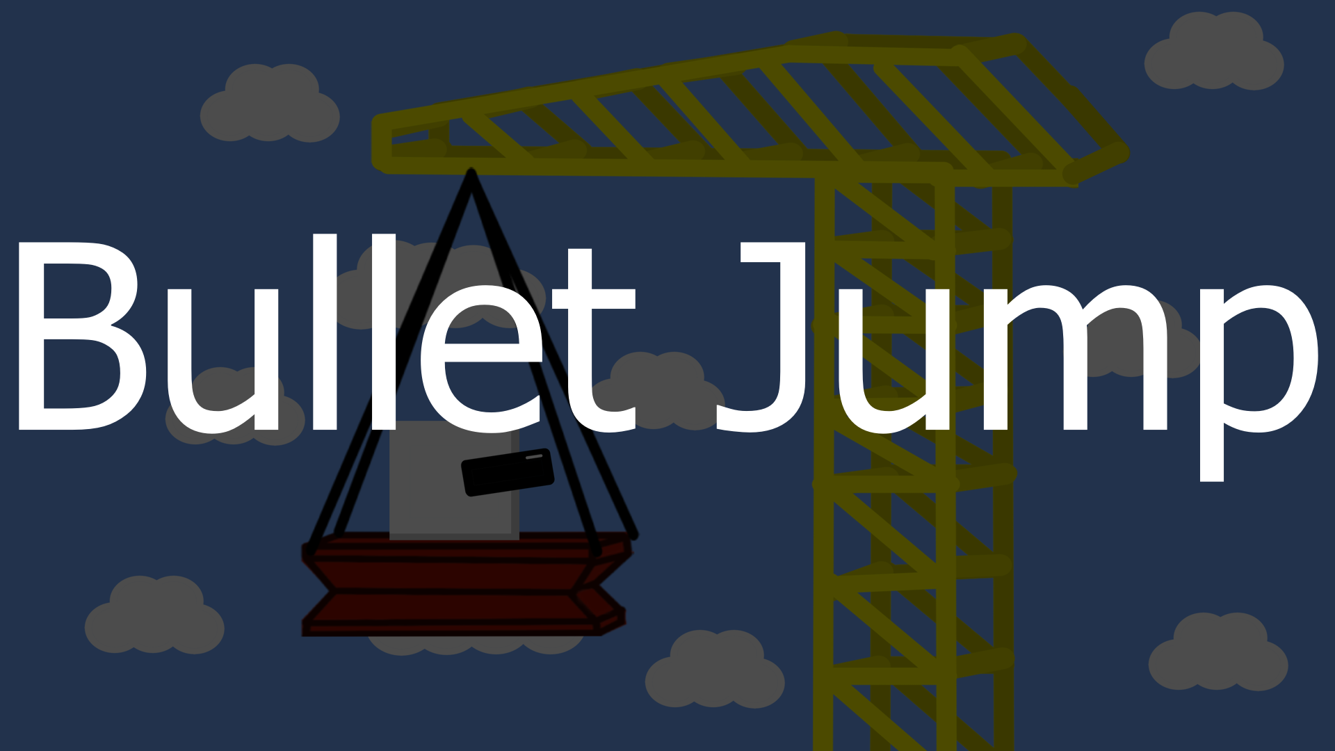
Bullet Jump
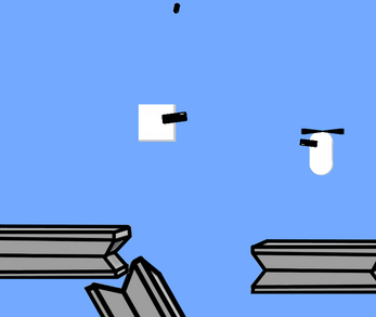
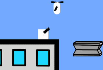
A Shooter Platformer, you have to reeach the end of the level and pass al the enemies!!
But, when you have less life, you can jump higher and you are faster too!!
Controls:
Look Around - Move the Mouse
Move - A and D or Right and Left Arrow Keys
Jump - Space Bar, W or up arrow key
Shoot - Left Mouse Click
Made in 1 week for Blackthornprod GAME JAM #3 for the theme LESS IS MORE
| Status | Released |
| Platforms | HTML5, Windows |
| Rating | Rated 2.7 out of 5 stars (3 total ratings) |
| Author | fire_soldier888 |
| Genre | Platformer, Shooter |
| Made with | Unity |
| Tags | 2D, blackthornprod-game-jam-3, less-is-more, Singleplayer, Unity |
Install instructions
Downlod and unzip the file, open the exe and Enjoy!!


Comments
Log in with itch.io to leave a comment.
noce but i sometimes i cant jump but overall
its chaotic and good.
A fun little bullet hell game! But a double jump maybe could make the game a little more fun!
a very interesting take on the theme, I like that. Also really appreciate the minimap, that's a nice touch. I wish enemies couldnt shoot through walls, but I guess seeing as getting shot is beneficial, it's not actually that bad.
Firing felt very good! Just wish there were more things to shoot. Great job.
It was a slow start (pun intended haha) but after I let myself take a beating from the bullets I had fun zooming-- Nice game!
Ok, a little bit of feedback:
a) the player moves VERY slowly and the jump hight is super low. I understand this is part of your interpretation of the theme but it feels very sluggish to move around. Work on the movement.
b) the graphics are cute, but as a fairly amatuer artist myself I can tell you that simple is ALWAYS better when you don't know what you're doing. Try using simple shapes, don't add detail where you can't make it look good. Another thing about the graphics is the resolution: A bunch textures look super soft and smudgy but some are very sharp, and that bizarre contrast (I assume something that has to do with the way you imported them into unity) looks really wrong. Your shading is also very inconsistent. Something to work on.
c) as for color work, there should usually be a big contrast between the foreground and background so they don't interfere or mix with each other: if the clouds (the background) are white, don't make anything in the foreground white as well (like the player) it happened multiple times that the player's white mixed with the cloud and i couldn't tell what's going on.
d) the UI shouldn't be so big, it distracts from the game and makes certain areas hard to click/see. pause button should be small and on the top corner, the health should not block half the screen, etc.
I'm sorry if I come off as a little harsh here, I just say this because I believe if there's a will there's a way, but only if you also have the will to take criticism and improve for next time. Hope to see you compete in more jams!